Friday
Friday: Shapes All Around the Loop
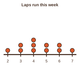
"The sign-up sheet has a column for laps run this week," Comet says. "Eleven runners filled it in."
Wren reads the column. "2, 3, 3, 4, 4, 4, 5, 5, 6, 6, 7. What do you notice?"
"Most ran 3 to 5 laps," Comet says. "A couple ran 6 or 7. The tail points to the right."
"So the mean, 4.5, sits above the median, 4," Wren says. "Report the median and IQR for this one."
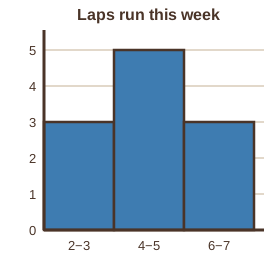
Nova projects a histogram with bins two laps wide. "Would you like a hint? Counts can be plotted just like times."
"Lap times, step counts, laps per runner," Comet says. "Any number that lands on a number line gets a plot."
"And every plot gets a shape, a center and a spread," Wren says. "That is the whole week in one sentence."
Counts are data too
Lap times are measured. Laps per runner are counted. Both are values on a number line, so both get the same three plots.
The eleven sign-up counts are 2, 3, 3, 4, 4, 4, 5, 5, 6, 6, 7. The median is 4 and the quartiles are 3 and 6.
Review: the week in one table
| Question | Symmetric set | Skewed set |
|---|---|---|
| Which center? | mean | median |
| Which spread? | standard deviation | IQR |
| Mean and median | close together | mean pulled toward the tail |
| Which plot shows shape fastest? | histogram or dot plot | histogram or dot plot |
- Dot plot: one dot per value. Histogram: bars over equal-width bins. Box plot: the five-number summary.
- Mean: sum ÷ n. Median: the middle value in order.
- Standard deviation: square root of the mean of the squared distances (the crew divides by n). IQR: Q3 - Q1.
- Compare groups by center and spread together. Let shape pick the measures.
- Read the question.
- Tap your answer.
- Read the question.
- Tap your answer.
| Statement | True or false? |
|---|---|
| Laps per runner can be shown on a dot plot because each count is a number on a line. | ? |
| 6 - 3 = 3 | ? |
| For a skewed set, the mean is the better center to report. | ? |
| A histogram with bins two laps wide puts 4 laps and 5 laps in the same bar. | ? |
Mark the mean with a small arrow. Notice which side of the median it lands on.
A full week of plots. Tomorrow is Track Day: show your family a dot plot of your own data.