Friday
Friday: Box Plots and Review
Rocket squints at a new picture on the Numbers Desk. "A box with whiskers? Where did the dots go?"
"Inside the box," Raven says. "Nova drew the sack hop times a third way."
Nova brightens the screen. "The whiskers reach the fastest and slowest runs. The box holds the middle half."
"What do you notice about the line inside the box?" Raven asks.
Rocket studies it. "It splits the runs in half. Half the runs were faster, half were slower."
"That line is the median," Nova says. "You will meet it properly next week."
Rocket leans back. "Dot plot, histogram, box plot. Three coats for one set of data."
"And three ways to see its shape," Raven says. "Pick the one that tells the story best."
The box plot
A box plot sits on a number line like the other two pictures. It uses five numbers from the data.
The two whisker ends mark the least and greatest values. The box holds the middle half of the data.
The line inside the box is the median: the value in the very middle when the data is in order.
A box plot hides the single values and the peaks. It shows how far the data reaches and where its middle sits.
For the sack hop times, the whiskers reach from 9 to 16 seconds. The median line sits at 12.
The box runs from 11 to 13.5. Half of all the runs landed inside that box.
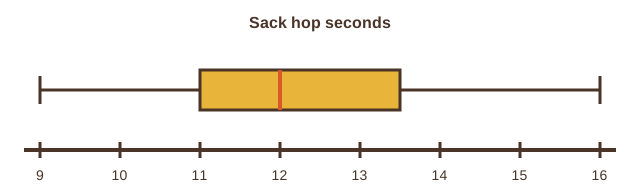
| Part of the box plot | Sack hop seconds |
|---|---|
| Left whisker end (least) | 9 |
| Left edge of the box | 11 |
| Line inside the box (median) | 12 |
| Right edge of the box | 13.5 |
| Right whisker end (greatest) | 16 |
- Read the question.
- Tap your answer.
What is the slowest time shown, in seconds?Where is the median line, in seconds?How far does the whole plot reach, from least to greatest?Where does the left edge of the box sit, in seconds?Data in everyday life
Statistical questions are everywhere. How many minutes do people in your home read each night? How many steps to the mailbox?
Each one needs data, and each data set has a shape. Once you can see the shape, you can tell its story.
This week you learned three pictures. A dot plot shows every value. A histogram shows groups. A box plot shows the reach and the middle.
Every picture starts the same way: a question that expects many answers, and a number line to hold them.
Next week you will put a number on the center of a data set and another on its spread. The pictures will help you check them.
- Read the question.
- Tap your answer.
| Statement | True or false? |
|---|---|
| A histogram groups values into equal-width bins. | ? |
| The median line of a box plot marks the greatest value. | ? |
| A gap is a value inside the range that no one answered. | ? |
| The sack hop box plot reaches from 9 to 16 seconds. | ? |
| A statistical question has exactly one correct answer. | ? |
| The box of a box plot holds about half of the data. | ? |
- ?Write a statistical question that names a group and a measure.
- ?Collect one answer from each person, writing only the number.
- ?Put the answers in order from least to greatest.
- ?Draw a dot plot, a histogram or a box plot.
- ?Describe the shape: peaks, clusters, gaps and far out values.
Week 10 is done. Next week you give the center and the spread of a data set a number each: mean, median, range and more.