Monday
Monday: Three Pictures of One Data Set
Mist hangs over the park loop at seven. Comet stands at the gate cone with a stopwatch.
"Eleven practice laps on the short loop," she says. "One click each time I pass the cone. Nova, log them."
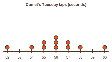
Nova hovers, a glowing tally on her side. "Logged. In order: 52, 54, 55, 55, 56, 56, 56, 57, 57, 58, 60 seconds."
Wren stacks a dot for each lap on a clipboard. "What do you notice?"
"They bunch at 56," Comet says. "A few spread out on each side. It looks like a small hill."
"One data set, three pictures," Wren says. "Dots, bars and a box. Each one shows something the others hide."
Nova dims her glow. "Would you like a hint? Start by putting every lap time in order."
"What can we make?" Comet asks. "A plot of every practice lap before the fun run."

The crew's Tuesday lap times
Every number this week is the crew's own made-up reading from Nova's Run Log. These are Comet's eleven laps on the short loop, in seconds, already in order.
| Lap | 1 | 2 | 3 | 4 | 5 | 6 | 7 | 8 | 9 | 10 | 11 |
|---|---|---|---|---|---|---|---|---|---|---|---|
| Seconds | 52 | 54 | 55 | 55 | 56 | 56 | 56 | 57 | 57 | 58 | 60 |
A solved problem to study
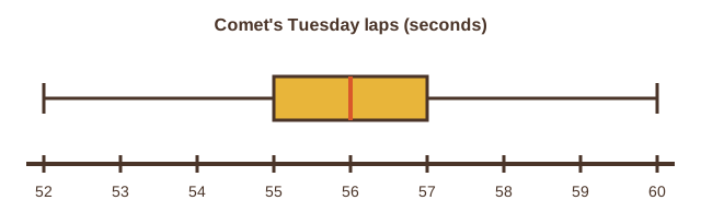
Here is how Wren turns the same eleven values into a box plot. Study each step before you try your own.
- Put the values in order. The least is 52 and the greatest is 60.
- Find the median, the middle value. With 11 values, it is the 6th: 56.
- Find the first quartile, the median of the lower five values: 55.
- Find the third quartile, the median of the upper five values: 57.
- Draw a box from 55 to 57 with a line at 56. Draw whiskers out to 52 and 60.
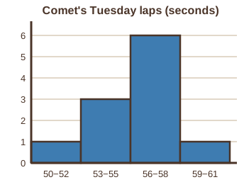
The histogram sorts the values into bins of equal width and draws a bar for each count. Here the bins are 3 seconds wide.
Bin 50 to 52 holds 1 lap. Bin 53 to 55 holds 3. Bin 56 to 58 holds 6. Bin 59 to 61 holds 1.
The dot plot keeps every value. The histogram trades detail for a clear shape. The box plot shows the middle half at a glance.
- Read the question.
- Tap your answer.
- Read the question.
- Tap your answer.
| Statement | True or false? |
|---|---|
| A box plot shows the least value, the quartiles, the median and the greatest value. | ? |
| 57 - 55 = 2 | ? |
| A histogram shows each value as its own dot. | ? |
| In a dot plot, a taller stack means more values at that number. | ? |
Under it, draw the box plot with the box from 55 to 57. Check that the two pictures agree.
A strong start. Tomorrow you measure the center and the spread with numbers, two different ways.